

CHECK OUT THE VIDEO I DID ABOUT THE NEW LOOK
Last Friday we had a really nice sell off, which extremely rare these days. But what does it mean? For an answer to that we have to look at all the charts. So in this weekend update, I'm going to go over the monthly, weekly, daily, hourly, and the 15 minute charts.
The question that always comes to my mind, is whether or not technical analysis actually works? I've done my best to learn it, and to adapt to fit in the news, as well as the "manipulation factor". But, it's still not perfect. The reason probably lies in the fact that I might interpret the charts different then the next person.
This "difference of opinion", between myself and other people, is the exact reason I have this blog. There isn't anyway that I can cover everything, and put all the pieces together. That is why I need YOU, the reader and commenter.
By everyone posting their thoughts and comments, we all are then better informed. Hopefully, we can adapt and still make a profit from the market, even if it goes against us. Believe me... I know, as it's went against me too many times.
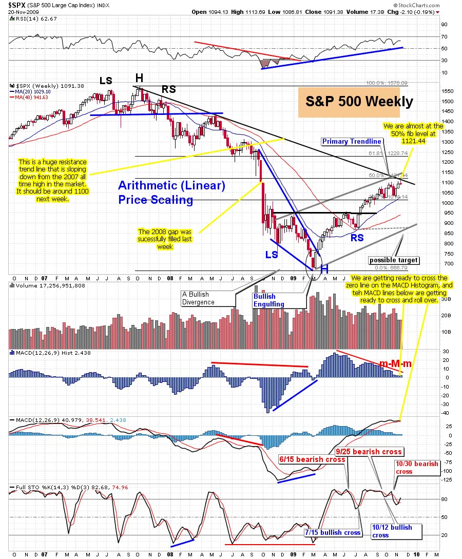
So let's dive into the charts, and try to figure out what's next. Below we have the monthly chart of the SPX, which now is clearly showing a "Topping Tail". That's a very bearish signal, which means that the "Top" may very well be in. If so, then it's probably down hill for the next several years. But I'm not convinced that this is the final top, as the MACD's and STO's haven't rolled over yet. That leads me to believe we will have 1-2 down months, and then back up to the fake print area of DOW11,816 by the end of this summer.

Moving on to the weekly chart, we see that we just put in a very bearish reversal candle, closing at the low end of the candle. You can also see that the MACD Histogram put in a lower candle, and that we have a bearish cross on the Full STO's. The RSI is also pointing down now, and hasn't done so since January. Notice how steep the downturn is on it. This is very bearish.

Now let's look at the daily charts. The first daily chart shows the SPX, with another very bearish red candle on Friday. Notice that the 10 EMA (blue line) is just about to cross over the 20 EMA (red line), which hasn't done so since the January sell off. Look at the RSI, as it's fell from the "above 70" area, and is now at the 50 line, and pointing down. I expect it to break soon, which will give the bears more power. The red and green ADX lines are criss-crossing, but I expect the -DI (red line) to rise back up soon, causing more selling.

Now let's look at the daily chart of the SPY, with some different indicators. The one thing that stands out is the clear break of the rising support line. The first break was on Tuesday, and then the market back tested the line on the next two days, and finally failed to get back above it on Friday, as it sold off hard. Looking at the Full STO's you notice that the black line is pointing back up and touching the red line. This indicates that the market could go up on Monday, or even Tuesday too. I expect it to fail and roll back down, not crossing the 50 level.

Let's look at the 60 minute charts now. Now this chart is from Ron Walker's site (he's "the chart pattern trader"), and he has it marked as a "head and shoulder's" pattern, but I disagree with that labeling. From what I've learned, a H&S pattern must have a rising trendline, with the right shoulder having the higher part of the trendline. Meaning that it can't be a level trendline (support line). It must slope up on H&S patterns, and slope down on Inverse H&S pattern.

Regardless, it still looks like the market still pointing down. The MACD's have rolled over and are pointing down, and are also below the zero line. The Full STO's are still going down, and then the ADX line is gaining strength with the -DI (red line) on top and rising higher. All are bearish signs, indicating that the market is likely to open down, or flat, and start selling off. The only question is whether or not it will bounce at the triple bottom or just gap down below it on Monday.
Looking at the 15 minute chart, we see it is also pointing down, with the Full STO's still going down lower, while it's already below the 20 level. This is very bearish. That triple bottom support is about the only bullish thing I can find right now. Look at the MACD, as it's still going down too, and the RSI is at the 30 level, giving strength to the bears. Plus the ADX line is rising, giving power to the DI line on top... which is the negative line.

I think that we are either going to see a gap down on Monday, and continued selling until we hit 117.50 spy for the first level of support, (which should give at least an intraday bounce), and then 115.00 spy, which should be a multi-day bounce. Or, we open flat, trade sideways for the day while the MACD's and Full STO's roll back up. If so, then I'd expect them to peak on Tuesday, and start back down by Wednesday.
The moves up should put in a nice bear flag pattern, as I don't expect the market to get back above Friday's high. Maybe a 50% retrace, but probably less. This assumes that we hold the triple bottom and don't gap down past it on Monday morning. But either way, I'm looking for the week to be down again.
Red


nice site red
Thanks Bear/Bull…
Did you watch the video tutorial I did? Hopefully I explained it well enough?
Yes I did. Its very well done.
You know whats funny? I thought for the longest time with a website name reddragon I thought you were Chinese LOL
Keep up the good work
LOL…
No, I'm full blooded American, blond hair blue eyed down to earth country boy, about 6 foot tall, 200 pounds, and 45 years old. I've lived in Florida for 20 years, but I'm now working out of state… thanks to the wonderful economy we have!
Still have my place down there, and hope to go back soon. With this tough economy, you have too take work where ever you can get it. Unfortunately, that's not in Florida right now.
I think Floirda has great potential though. So much beautiful coast line.
It looks to me a gap down tomorrow. I'm going long if it closes down tomorrow. I feel we afre going to close at new highs very very soon. IMO
The Index charts have me worried about next week too!
Bottom fishing, ( most beaten down) is like pulling teeth. I get one or two up days, and then the 3rd day, I get a lower low.
Well Z,
As you can see by all the charts, this market is heading down in the short term. Maybe June will turn back up, but it's looking bad for May.
The first spot I'd go long at is 115.00 spy, for a several day swing trade. I'd have to re-evaluate the charts at that time, but I'd say that it's going to head lower after the bounce.
I have a fake print of 107.38 spy, and Sundancer caught a fake print of DOW 10,000… meaning that we are going down to that level before breaking out above the current high.
We also have another fake print of DIA 118.16 (about DOW 11,816), which I think will be the final high of this P2 rally, probably hitting there in August or September.
After that… well that's another story.
Red
I like the new look!!!!!!
I took a vacation last week after we printed the top on 4.26
Good news for the bears, the upward gyration on Wednesday & Thursday is going to tilt the odds heavily towards a deep downward thrust.
I'll give some more details after I open the database up tomorrow.
Thanks Sun…
We all missed you. Glad you like the new look. I put a video up too… explaining the site changes. Be sure to watch it.
I smell conspiracy. Goldman got hauled in front of Congress and guess who disappeared too? hmmmm… hey, Lyold, is that you? hehe
New videos and update on Hotoptionbabe.com Looks like a face lift Red…good for you
http://hotoptionbabe.com/2010/05/02/more-videos…
I'm getting old girl… guys need a face lift too! LOL.
By the way, I watched your video's and they are very good, and informative. Keep them up, I'm always learning something new from you.
There u go, Red.
http://www.cenegenics.com/
Looks like hard work, I'll just wait for the magic pill to come out. LOL
Wow…what happened here. Great new look, Red. Loved the lighting strike at the preload! Keep up the good work!
Glad you like the site Al
Like this new look alot. Very constructive and informative post. Thx.
Thanks Joey… it's been a long time coming. I'm loving it too.
Hopefully nobody got whipsawed out of their positions last week.
Remember that pesky TL that SPY won't get a divorce from?
This chart makes things very simple
http://www.flickr.com/photos/47091634@N04/45739…
The initiation gap below the TL came on 4.27 with the back kiss of death on 4.29
What's scary about this sequence is this is the same dance that happened during Feb. 2009. The back kiss of death came on 2.26 which gave birth to a -15.77% harvest of speculative capital.
Other important things to take note of on the chart:
Orange TL: This is the TL that the SPY gapped below on 10.8.2008 & back tested @ the 11.4.2008 high, and also held the SPY during the January high.
Yellow TL: held the SPY during the 10.10.2008 low
The next stop will be @ those TL's.
Probability continues to decrease that those 2 TL's will stop the downward thrust.
I got out on Friday at the close. I'll be getting back short again today. I expected a bounce after that large sell off.
Red,
Nicely done. Constructively, The eye wants to see your charts and content at 70% of the page rather than 50% of the page. Your advertisers are getting as much press as you are. Just my thoughts.
Thanks for what you do.
Yeah I know…
That stock quotes box is what is requiring that column to be so wide. When you hover your mouse over the stock symbol to see the small popup of the chart, it always pops up to the right side of the stock number.
If I shrink (or narrow) that column, then the popup chart will be cut off, and you can't see it. I'll have too do a poll to see if that's important or not for everyone.
If it's not too important, then I can narrow that middle column and give more room for the content.
Thanks for the suggestion…
I was able to edit the code on the stock box, causing the popup to shift left enough to see when I narrowed that column. So, the content column went from 460 px to 520 px, which is about the max I can get without deleting things.
I think it looks a lot better now, so hopefully everything else lines up correctly in the columns. I had a few times when the stock box would say “error, can't connect”, but it came back when I refreshed the page.
Also, I lower the limit from 10 posts on the home page to only 7 posts, so it will load faster.
Thanks for the input…
Red
Another boring Monday it seems… Well gang, it looks like the market is rolling back up on the 60 minute chart, from the oversold conditions. I expect it to peak either today at the close, or the first half of Tuesday.
The VIX should also bottom at that time too, and start to curl back up, just as the market starts to peak and roll over. So, I'm sitting in cash, and waiting for the end of the day to see where it's at.
I will either take a short position at the EOD, or early Tuesday, as I expect that whatever level the market reaches… that will be the high for the week.
I'm looking for 117.50 spy, or possibly 115.00 by the end of the week. The jobs data on Friday will be a big mover in the market. It could cause a really nice sell off?
http://twitter.com/annamallgirl see my newbackground with sexy lingerie
Bad girl… Bad girl… I like it!
Gang, I think we are going to that fake print of 120.83 spy from yesterday (intraday, on the 10 minute chart). It's amazing how many of those prints play out.
GILD, first up day of 4 up days in a row. That's my best guess.
Well Z,
I just went short 5 minutes ago on the spy. Not sure if we go up to 120.83 or not (the fake print), but this will have too be close enough. Not sure about GILD, as I don't follow that.
Anna caught another intraday fake print of 118.30 spy in the afterhours session. That should be our first downside target, and they usually play out within 1-2 days.
We shall see I guess… (As I'm typing this, the spy is moving up again. LOL, those fake prints are amazing)
I posted about an 1 1/2 hours ago, IWM intraday high would be 73.2, missed by 7 cents, 73.27, sue me.
LOL… that's great call. I'd be proud of only missing by 7 cents too.
on my 15 minute chart., IWM is usually the one with a clearer signal, than SPX,DIA,QQQQ, mostly.
Gang,
I've just been told that Tazman, a commenter on Slope of Hope (link in my blogroll) seen a fake DOW print of 66.66! Tell me these clowns aren't serious… Is this another sign of a crash coming?
Here is a link to Tazman's Disqus account. You will have to go back through the comments to find it, but if anyone else seen, and happened to make a screen capture of it… please post it.
http://disqus.com/Tasman/
I didn't see anything of the sort so far and looked @ every BTW that would be 6600 on the dow
I found the spot where he mentioned it. Here is a screen shot of it…
http://reddragonleo.com/wp-content/uploads/2010…
Sold all my longs on what may be the last train leaving the station. Net short via May 119/118 spread. Market VST short signal in effect. We are still a way to go before any IT short alert shows up.
I wondered where you was… Sleeping in late from working all night a McD's huh? Earl is on yesterday's post. I guess it's hard to navigate the new site. Hope everyone likes it, and gets used too it.
I went short today too, with a 118/112 put spread, when the market peaked at about 120.55, so I got in at a good spot.
Carl at day’s end:
1181-1195 estimate for today (14 points)
Modified to 1187-1201 later
1187–1202 actual today (15 points)
Modified estimate nailed it 🙂
Trades: In /ES at 1197.50 (very late in the day), did not sell (1198 currently)
Grade: C (may make some money tomorrow)
Carl is pretty gutsy going long at the end of the day. I went short. I guess he will take my money tomorrow, or I'll take his… LOL.
(By the way, I changed that color to blue, so you can see it now. Why they had it light grey in the first place, is beyond me?)
I went short as well, but I'm not yet sure what I should have done.
Carl doesn't hold overnight unless he has confidence, but frankly, the market has been surprising Carl so much lately, being opposite of whatever he is doing seems the better play.
Much better on the color 🙂
Great great charts thanks. I see now a diamond top formation. http://midasfinancialmarkets.blogspot.com/2010/…
Yeah, we are close to falling off a cliff. They need to squeeze out all the bulls and bears, by whipping the market up and down every other day, but I suspect that the real direction will play out to the downside… and probably on Thursday or Friday of this week.
TZA opened down 2%. TZA was down 1.7% at it's high, and closed down 6.7%.
A gap down today from $5.93 to $5.83 was not filled.
We are now in a Full Moon Trade, which tends to favor TNA.
AmericanBulls had TNA with a Wait, & TNA was up today, so TNA likely will be a possible Buy tomorrow morning.
AmericanBulls had TZA with a Hold, & TZA was down today, so TZA likely will be a possible Sell tomorrow morning. TZA bought at $5.54. TZA closed today at $5.53, so this trade is now flat.
Volume for TZA today was average.
$RVX (VIX for $RUT) closed down 4.8% with TZA down 6.7%. No divergence.
TZA was up two days, and then down two, up one and now down one. Chop. Hard to read good or bad.
The low for TZA was from five days ago at $5.30. Today’s low was $5.52, 4.1% higher. Good for TZA.
Today, Ultimate Oscillator for TZA rose from 46.74 to 46.92 – a gain of 0.18 while TZA fell 6.7%, a Divergence. Good for TZA.
MACD on the monthly chart had been a flat line at -0.50 for 10 days. Now is moving up a bit, and flat today. Good for TZA.
Bollinger Bands for $RVX (VIX for $RUT): Today’s long red candle closed below the upper Bollinger Band after closing well above it yesterday. MACD is aggressively rising. This could be the 2nd day of a 3-day $RUT buy signal. Bad for TZA, perhaps.
Bollinger Bands for $RUT: Today’s long white candle bounced from the mid Bollinger line (20 day moving average). The last time $RUT fell to touch the 20 day moving average, it bounced for days. MACD has rolled over (down). Bad for TZA, perhaps.
Bollinger Bands for $RUT:$RVX ($RUT vs VIX for $RUT): yesterday, the black candle today was entirely below the bottom Bollinger band(This happened Jan 22nd, and at that time $RUT fell generally for 9 days). This also happened 4 days ago and was followed by two up days. The close below the lower Bollinger Band is considered a $RUT buy signal. Bad for TZA.
TZA had a higher low, lower high and much much lower close – Bad for TZA, perhaps.
Money flow for the Total Stock Market:
$ 1,276 million flowing into the market today on an up day 2 days ago.
$ 108 million flowing into the market yesterday on a down day.
$ 1,375 million flowing into the market today.
Bad for TZA.
I will post the AmericanBulls candlestick interpretation a bit later.
Overall, it looks confusing for TZA. (If I absolutely needed to pick good or bad, since I own TZA right now, I would go with good.)
May 5th or May 16th
May 5th =6 TD's below SPY's TL
May 16th=12 TD's below SPY's TL
2.20.2009 – closing low came 12 TD's after break of TL
7.2.2009 – closing low came 6 TD's after break of TL
1.22.2010 – closing low came 12 TD's after break of TL
http://www.flickr.com/photos/47091634@N04/45758…
Can I make my wish come true? Hmmm… 12!
the only thing that makes me think it might be 6TD is the way the operators are debasing GS
It's identical to the GLD debasment starting on 12.4.2009, we're currently on 12.18.2009
Basically, by dumping GS huge on that first day, and holding the market up, they can get GS to sell off 10%, but hold the market back to a lot less… maybe 5%?
Well, I have 115.00 spy as an important support level, that should provide at least a multiple day bounce. If we only get a 6 TD event, then that's the bottom and it's back to the usual slow grind higher every day, for the next several months until we reach DOW 11,816 (probably late summer or early fall).
I believe that your yellow trendline is also coming in around 115.00 as well. I don't know if we will sell off below it to 107.38 spy (or your 107.82/Dow 10,000), or not… but I'm pretty sure that it's not going to happen before this May OPX.
There are too many short positions to pay out on, and you know they aren't going to give away free money… at least not to the average Joe trader. Maybe a sell off down to 115.00 by the EOW, or early next week.
Then a grind up into OPX to wipe out all those put contracts. After OPX… well that's the 64 thousand dollar question?
yeah now you're seeing the light
so afr it looks like more downside to come … tomorrow???
Then a grind higher to 125-127 by opex a dip to ???? and then another wave “final” to 130???? in june. Too early to say
I'm afraid any sell off now, will be short lived, as my newest post shows way too many May puts…
$SPX
4.26.2010 high came 80 CD after 2.5.2010 low
9.23.2009 high came 77 CD after 7.8.2009 low
10.2.2009 low came 9 CD after 9.23.2009 high
9 CD after 4.26.2010 = 5.5.2010
the only chart that really matters right now
GS
http://www.flickr.com/photos/47091634@N04/45764…
closed the day sandwiched between light purple & white containment
should GS print 134's, be cautious for those who are highly levered short
The Daily view from Americanbulls
TNA had a Wait signal for today, was up today, and is a possible (unlikely) Buy tomorrow morning.
TZA had a Hold signal for today, was down today, and is a possible (unlikely) Sell tomorrow morning. The TZA buy price was $5.54. TZA closed today at $5.54, flat since the buy.
Of the stocks & ETFs I follow, only these are to hold on to:
GLD (gold), SLV(silver), UCO(2x Oil), AAPL, QQQQ, EWG(Germany), EWQ(France)
The list to avoid: EWU(England), EWX(emerging mkts)
The following are possible buys tomorrow:
IWM (1x $RUT), UWM (2x $RUT), TNA (3x $RUT) , IYR(1x RE), URE(2x RE), DRN(3x RE), ERX(3x energy), AMZN, DRI, GOOG, GS
Just one possible sell: USO(oil)
Action for TNA or TZA for tomorrow: Possible buy on TNA, possible sell on TZA
GLD is always a buy now.